Visualizing my Electric Energy Options
This site utilizes Google Analytics, Google AdSense, as well as participates in affiliate partnerships with various companies including Amazon. Please view the privacy policy for more details.
Today’s the day my electrical contract expires, so it’s time to choose another one.
For those outside Ohio, or otherwise don’t know, in we have something called Apples-to-Apples where we can choose our electrical supplier. If we don’t choose, it’s chosen for us (normally the same as who bills us), which may cost more than what is available.
Choosing the best - or even the cheapest - supplier isn’t as simple as choosing the lowest dollars per kilowatt hour ($/KWh) available. You also have to consider the term length (measured in months), if there’s a monthly fee, and if it’s a variable rate.
I don’t trust variable rates (the terms never say - or at least I can’t find - exactly how the rate is variable) and I don’t use enough electricity to justify a monthly fee - even with a low rate - so the first thing I do is filter out those options with a variable rate or monthly fee.
That leaves two other variables - $/KWh and term length. Two variables that will fit nicely on an x-y axis.
So I plotted them as a scatter plot:
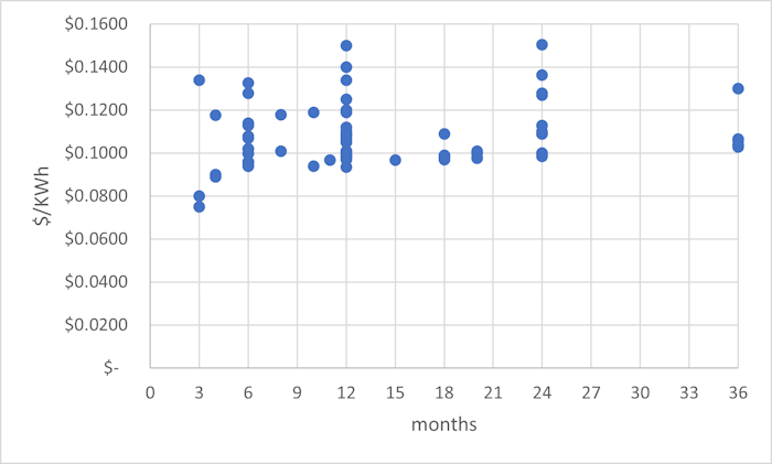
What’s not surprising about this chart is that the cost tends to increase as the term length increases. The cheapest option - $0.0749 / KWh - is for only three months.
What is surprising is the number of options above, say, 10¢ or 11¢ even at the lower range of term length. The most expensive option - $0.1505 - wasn’t even the longest term. It was for 24 months. And the most expensive 3-month option - $0.1339 - was tied for 5th place as the most expensive option (oddly, the other $0.1339 options was for 12 months and from the same supplier).
Which option did I end up going for? The cheapest 12-month option: $0.0935 / kWh. Was it the best option? We’ll see in a year. For context, the contract that just ended was 7.19¢ / kWh for a 12-month term.
Leave a Reply