
Rethinking the Flag of Huber Heights, Ohio
This site utilizes Google Analytics, Google AdSense, as well as participates in affiliate partnerships with various companies including Amazon. Please view the privacy policy for more details.
I recently watched the following video on why city flags may be the worst-designed thing you’ve never noticed and began thinking about local municipality flags:
Huber Heights does have a flag, but the only image I could find from the City Flag and City Seal on the city webpage is rather low resolution:
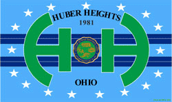 Low-resolution (250px × 149px) JPEG of the flag of Huber Heights, Ohio
I wanted to update it based on ideas in the video, but first I made an SVG version of the Huber Heights flag. The following is an exported PNG of that SVG:
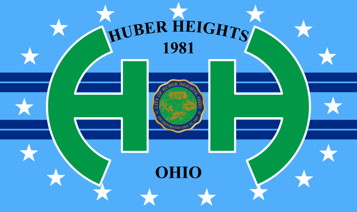 Better rendering of the flag of Huber Heights, Ohio
Now onto some of the core concepts from the video. Namely:
- Keep it simple.
- Use meaningful symbolism.
- Use 2-3 basic colors.
- No letters or seals.
- Be distinctive or be related.
The first thing I did was remove the seal in the center and the text:
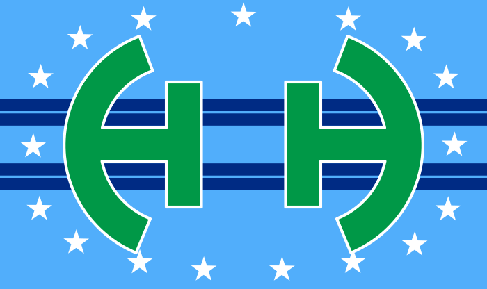 The Flag of Huber Heights, Ohio with the text and seal removed.
I felt the stars had no symbolism or purpose, as well as just looking awkward, so I removed those as well:
 The Flag of Huber Heights, Ohio with the stars removed.
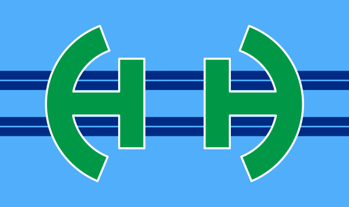
Next, I felt that the white border around the two H’s (aches?) made the flag too complex, so I removed them (or made them the same shade of green as the H’s):
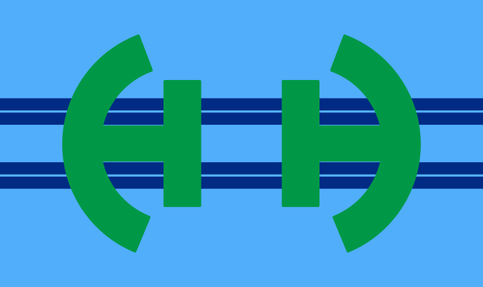 The Flag of Huber Heights, Ohio with no white border around the H’s.
I think that looks fine, but I also wanted to play with the colors a bit. I changed the colors to match the hex colors of the Flag of the United States based on this discussion on Wikimedia:
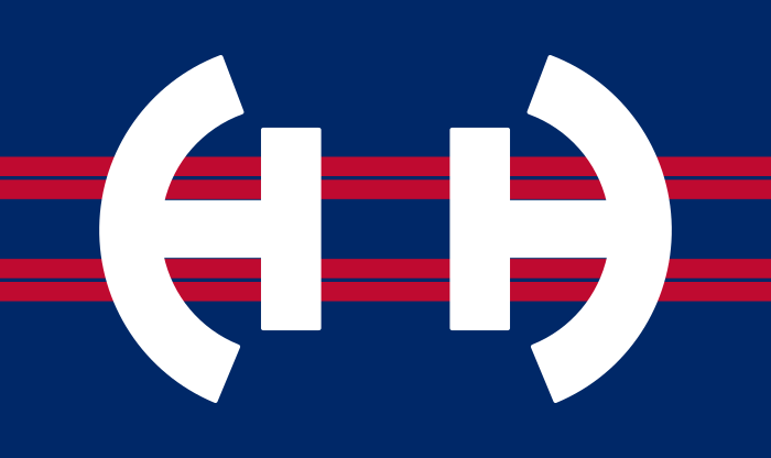 The Flag of Huber Heights, Ohio in Red, White, and Blue
These hex colors are #BF0A30 (red), #FFFFFF (white), and #002868 (blue).
I’ve had a few thoughts on other flags, such as Montgomery County Ohio, Greene County Ohio, and Toastmasters, but that’s a post for another day.
1 comment for Rethinking the Flag of Huber Heights, Ohio
Leave a Reply

My wife suggested I point out any symbolism in the flag. I didn’t add any symbolism, but the original did.
The two H’s obviously represent Huber Heights. The circular shape they are in represents an “O” for “Ohio.”
The two double-bands represent the two major thoroughfares that go through Huber Heights - Brandt Pike and Old Troy Pike.
There are seventeen stars. Ohio was the seventeenth state admitted to the Union.
Green and blue, for some reason, are colors “that had come to represent” Huber Heights. Don’t know why.
Reply to This Thread